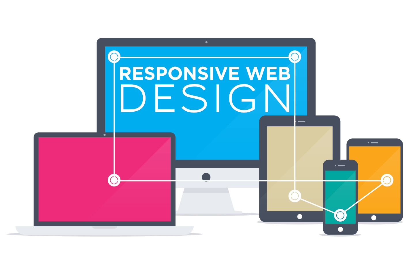
Webixia offers the development of a website that has a responsive design. Responsive website design renders web pages well across various platforms such as iOS, Windows Phone, Android, and Blackberry. A website loads fast and works fine if the website has a responsive design. Resultantly, your website appears and feels the best on desktops, laptops, tablets, and smartphones.
Responsive Design: Cost-Effective and Efficient
It is very cost-effective to use responsive design for the development of the website. Instead of developing two different websites, one for windows and one for mobile devices, you only work on the same website and build it with the utmost efficiency. The responsive design of the website meets the demands of all devices and makes web pages render the best across various platforms.
Responsive Design: Better Management of SEO
When you have a responsive design for your website, you do not have to build two different websites for your business. You only focus on one website, which works well on all kinds of devices and platforms. So, you are more capable of better management of Search Engine Optimization (SEO). With better management of SEO, your business grows and develops by the attraction of a qualified target audience, increased sales, leads, and revenue.
Your website is recommended by Google because your website is not repeated and the content of the website is not repeated on two different websites.
Why Would You Need Responsive Design For Your Website?
If you are not persuaded yet, here are some of the most lucrative advantages of responsive design that you must consider:
- Most of the customers have reached your website through their mobile phones and tablets. If the website glitches, users are not likely to recommend it to their friends and family. You will lose prospective customers by not having a website responsive design that makes a website work well on both mobile phones and tablets.
- 57% of all traffic comes from mobile phones. It is imperative to have the same website for windows and mobile phones to facilitate users. The responsive design of the website enhances the user experience (UX).
- It has been found that 75% of the users take their mobile phones and start searching when they want to solve one of the problems. If your website is not accessible on mobile phones, you are bound to lose many customers.
- 85% of adults retain as customers when they find your website impressive and plausible.